Did you know, Global Accessibility Awareness Day (GAAD) was on 16th May? To celebrate, I attended the brand new Accessibility Leeds Network. Accessibility and inclusion are topics I’m passionate about, so I’m always interested to learn more. Which is why I’m super-happy there’s a forum to share practice in my city now. 😃
Because I know, we can always do better.
No matter what you are aiming to achieve with digital, accessible content, design and experiences are ALWAYS important.
If you’ve got something important to communicate (climate emergency, anyone?), it’s important that your message can be accessed by everyone, not just able-bodied people.
What is inclusive design?
Inclusive Design is a methodology, born out of digital environments, that enables and draws on the full range of human diversity. Most importantly, this means including and learning from people with a range of perspectives.
Microsoft Inclusive Design (website)
Accessibility and user experience

This first public event from Accessibility Leeds focused on user experience. It included a talk, discussion and a screen reader demo. So we all had the opportunity to experience the impact of inaccessible websites and content.
Keep reading to learn how that went! 😉
Will Turner from NHS Digital (pictured below), opened the event whilst I was still munching on the pizza they provided. I left work later than planned – as usual! But, I still managed to do a bit of live tweeting. Live tweeting enables me to take notes, share practice and discover new likeminded people to connect with. All at the same time!
And those are just some of the reasons Why I Love Twitter (blog post).

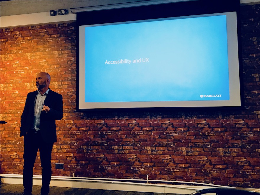
Accessibility and UX at Barclays

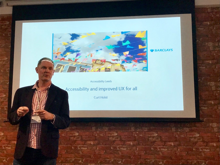
Curt Holst, Senior Digital Accessibility Consultant at Barclays shared their approach to inclusive design. Curt reinforced digital accessibility is not just for the benefit of a minority, as he highlighted:
One in five have a disability…we’re all disabled in some ways.
With over one billion people on the planet having a registered disability, we’re not talking about a minority group. We all feel somewhat disabled at times too, depending upon the context and environment we are in. In my teaching of technology for learning and academic practice, I’ve always said:
You do not need to have a disability to benefit from accessibility. Accessibility benefits everyone.
Curt provided us with examples of disability as context dependent:
- Permanent
- Temporary
- Situational.
This is based upon Microsoft’s Persona Spectrum. So when we start to recognise that, we can all identify with feeling disabled at some point in time.
Curt told us at Barclays, their approach includes three components:
Inspiring hearts, educating needs and enabling hands.
Accessibility myths
Curt also shared the following accessibility myths:
- My users don’t complain about accessibility so we must be doing OK.
- Accessibility is not my job.
- Fixing accessibility is expensive.
- The market is just too small to justify all this time and effort.
- Accessible design means boring design.
Fixing accessibility can be expensive though. Fixing a back-log of inaccessible content will take time and resource, if it is required. Universities along with public sector websites and apps are finding that out right now. However, if you take a ‘born accessible’ approach from the outset and work with technologies that are accessible, THAT isn’t necessarily expensive.
Inclusive Design Principles
Curt talked about inclusive design and he summarised the following Principles:
- Provide comparable experience
- Give control
- Offer advice
- Consider situation
- Be consistent
- Prioritise content
- Add value
Creating diverse personas
It’s really useful to create personas or avatars that represent the audiences you are trying to reach. So it was great to learn Barclays have designed diverse personas to represent their customers. For the Inclusive Teaching Project at the University of Leeds, a colleague (Jenny Brady) and I, have also designed diverse personas to support a scenario-based inclusive teaching activity. Those personas are an incredibly useful teaching tool.
Is your website screen reader accessible?
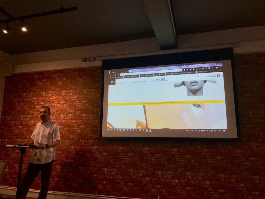
Up next was Barry Hill from Sky. He uses a screen reader (Jaws), so it was a brilliant opportunity for everyone to observe what it’s like for Barry to navigate the web. I’ve observed screen readers in action, so I knew what to expect.

Barry didn’t choose just any website though, he choose Beyonce’s. Apart from the fact that Jaws pronounces ‘Beyonce’ as ‘Bee-yon-kay’, her website is for the most part, completely inaccessible. As a result, Barry didn’t get to play her latest video or buy a t-shirt.
eBay it is then. 😉
Wanna learn more?
- Check out my Accessibility Leeds Network Twitter Moment.
- Learn more about the network over on the Accessibility Leeds blog
- If you’re in the Leeds area and would like to attend future Accessibility Leeds events, you can follow Accessibility Leeds on Eventbrite, Twitter and Facebook
- If you’re on Twitter, Accessibility Leeds members, speakers and sponsors are in my A11y Leeds Network Twitter List
- Microsoft Inclusive Design toolkit (website)
- Inclusive Design Posters from Barclays (The Paciello Group website)
- Inclusive Design Principles (website)

Leave a Reply